Father Pop
How Mike Salisbury defeated communism with sex, drugs and rock and roll.
Originally published in The Surfer’s Journal
IT’S NOON SOMEWHERE, but not at the Venice Beach bar where Mike Salisbury sits in a corner booth, absently spooning ice cubes into glass of white wine. At 73, time and motorcycle injuries have softened the lines that made him movie-star handsome not too long ago. Still, dressed like Johnny Cash in sweats, Salisbury has presence. On this gray, workday morning, while a handful of regulars and the sound system aspire to a Friday night, he quietly tells stories of his remarkable career in a zigzag, digressive fashion. It’s as if his long, rich life has burst at the seams and golden nuggets are spilling out all over the place.
One of those nuggets has to do with that red-hot minute in the 1960s when Salisbury lived on Balboa Island in a small apartment with Randy Nauert. This is significant because a half dozen years or so before, Nauert had taught his high-school buddy Rick Griffin how to surf. Griffin lived up the road in Palos Verdes. Meanwhile, John Van Hamersveld was residing in the instant-kitsch glory of the Hollywood Riviera Apartments, just blocks from Torrance Beach, where he would meet Griffin to surf.
Talk about formative.
Salisbury, Griffin, and Von Hamersveld spent their time at day jobs muddling through Chouinard Art Institute (later CalArts), surfing and scraping by while Nauert got busy working on the sound he’d been exploring since high school, something that would later be called surf music.
Times were good and times were tight. Salisbury says they “lived on oranges and avocados picked off the groves, cheap beer, and cheaper chuck steaks with mac and cheese when it was really lean.”
These guys had been drawing cartoons, painting, pinstriping, and internalizing Mad magazine since junior high. Now, they were making posters for their friends’ bands, logos for local shapers, and graphics for surf shops. Everything was just starting out.
Their budding talents converged around Surfer magazine when Nauert introduced Griffin to John Severson after Surf Fever screened at Nathaniel Narbonne High in Harbor City. Griffin debuted his seminal Murphy cartoon in Surfer, Van Hamersveld came on as an assistant and a designer, and Salisbury did a bit of everything—art direct, ad design, report, write, and contribute his own cartoons and illustrations, especially when the deadline-challenged Griffin fell behind.
Doing “everything” would become a Salisbury trademark, but what he did better than most was the right thing at the right time. Like putting Murphy on the cover of the August-September 1962 issue of Surfer, a move that both sealed the effervescent grem’s fate as perhaps the first avatar of a nascent surf culture and provided Surfer with a proprietary identity. “People got that cover tattooed on their arms,” laughs Nauert.
These guys would leave a few more marks on the landscape. Nauert was soon to take advantage of two technological advances—the Fender electric bass and the Fender Showman amp (reverb!)—to help create the sound of surf music with The Challengers, whose 1962 debut album, Surf Beat, would become the biggest-selling surf-rock record of all time.
Griffin, who did most of the Challengers’ early artwork, moved to San Francisco a couple years later where his album covers and concert posters for the Grateful Dead and other Haight-Asbury staples would help define the visual vocabulary of the psychedelic 60s.
Van Hamersveld was just year or so away from creating the iconic The Endless Summer poster, a detonation that would catapult him into a career fashioning some of the more persistent imagery of our lifetimes, including the Magical Mystery Tour and Exile on Main Street album covers, the official Los Angeles Summer Olympics posters and mural, and, of course, the Fatburger logo.
For a while, Salisbury cut a more modest profile. He produced the cover art for Dick Dale and the Del-Tones’ debut, Surfer’s Choice, and the logos and ads for regional outfits such as Ramsey Jay, Gordon & Smith, and Birdwell Beach Britches. But in the coming years and decades, his impact on our postwar pop culture and identity would be immense, if not always obvious. “You don’t see Mike, you see his work,” says Nauert. “He shaped how we saw everybody else. He was like the architect.”
What Salisbury was building, if you get right down to it, it was an idea, one of the most powerful ideas of the past 60 years—the idea of California. He would use that idea to fight communism. California would win.
***
BEFORE WE get to how Salisbury won the Cold War, let’s go back to the hot one that preceded it. In 1943, Salisbury was born into a Mayflower family with a military bent. His father was in the Army Air Corps, lots of uncles in the service, a cousin who was a highly-decorated Vietnam Marine vet. Salisbury himself had a congressional appointment to Annapolis but turned it down. “I’d been on so many ships in my life, I just couldn’t see being on a ship,” he says. “All gray with that smell of diesel all the time.”
His life at sea came courtesy of his stepfather, a Navy man whose career dealt Salisbury a peripatetic childhood. They moved to Long Beach from San Francisco when Salisbury was in the first grade, leaving the gray, dense city up north for a wonderland of tract homes, rides on the Red Car, and a perpetually shining sun. It made an impression.
“The girls had bows in their hair and the men wore t-shirts with the sleeves rolled up, cigarettes balancing on their lower lips,” recalls Salisbury. “We had motor scooters and motorcycles and old jalopies and a neighbor had one of the first TVs, which all of us kids would watch sitting cross-legged on the floor.”
In Southern California, the future had arrived. Families that weren’t military worked in aerospace. Salisbury would attend jet-fighter test flights. The aesthetic differences between the two major geographies of his childhood were keenly observed.
“In Southern Californian design and architecture, it is all streamline, space age,” he says. “San Francisco is very Victorian and New York, very gothic. Greater L.A. was the new world. Cars were customized to look streamline. Houses were new and modern. Restaurants were drive-ins with towers replicating the Einstein Tower in Potsdam. New was not wrong. Every kid had to have the latest and most faddish. Consumerism began in earnest in Southern California. More was not enough.”
Salisbury counts eleven moves in his first eleven years. Back to San Francisco for the fourth grade, then Monterrey Bay while his stepfather attended the Naval Post Graduate School. At age 10, Salisbury lived in naval barracks across the Hawaiian Islands before the family set sail for the Marshalls.
When the first hydrogen bomb was tested off Bikini Atoll 1,000 miles away, Salisbury says the women and children weren’t aware what was happening. Instead, they were put in shelters the day of the blast and told there might be a tidal wave. “But we escaped the shelter and swam and spear-fished and collected coral and shells at low tide on the reefs that were the tops of the volcanic cones that made the atoll and that wave never appeared.”
Salisbury’s family made it back to Southern California and the Long Beach suburb of Lakewood in time for junior high and high school. Lakewood then was an exemplar of postwar planned communities, offering the illusion of a Leave It To Beaver existence for the middle-class. Except, Salisbury says, he and his peers were dressing like Marlon Brando in The Wild One and acting like they were starring in The Concrete Jungle.
Attracted to such counter-narratives, Salisbury says he would ride his bike over to George Barris’ studio in Lynwood everyday to study Von Dutch. Soon, he was pinstriping everything from his notebooks to his bike to the furniture in his room. He drew cartoons for the school paper, caricatures for the yearbook, and naked women and cars for himself and his friends. He got attention for his drawings. “Especially from the girls,” he says.
This was the dawn of Kalifornia Kool—surf, hotrods, lowbrow art, rebellion from suburban anesthesia—and Salisbury wasn’t there to be an observer.
***
WE MEET up again at the same bar a few days after our first encounter. It’s still not noon and the bar is still too eager with wide doors inviting in the foggy cold and a sound system stuck on a Friday night. This is the new, friendly Venice Beach and Salisbury has been living here in a three-story townhome just a few blocks away since 1998.
It was different when he was coming. “Did you see Inherent Vice?” he asks, voice barely audible over the din. “It really is a picture of what it was like in the 70s. You had all this wild vice, but if you needed money, you could get money and have a job because there was so much in the entertainment business to make money off.”
By 1974, Salisbury had already established himself as a creative force in Los Angeles and was hot off a stint as art director of the fabled West magazine when he got tapped by Jan Wenner to completely redesign Rolling Stone from its rigid newspaper-style inception into its more freewheeling and familiar tabloid incarnation. The first day on the job, Salisbury says, Wenner called him into office, peered across a large oak table, and said, “You gotta fire Annie Leibovitz. She’s costing me too much money.”
According to Salisbury, Leibovitz had a penchant for abandoning rental cars wherever she hopped out of them and burning through tons of film. She wasn’t easy or cheap, but Salisbury knew firing Leibovitz would be suicide. “I said, ‘She’s the key to what that magazine is all about, which is rock and roll stars.’” Instead, Salisbury had an idea that would give them more bang for their buck and didn’t hurt Leibovitz’s career, either. “I’ll make the pictures bigger,” he decided.
Back then, Salisbury commuted to San Francisco from Los Angeles, due in no small part to Rolling Stone’s work habits—long lulls broken up by three-days of deadline mayhem. When their backs were really against the wall, a woman in a nurse’s uniform walked around, “giving everybody speed to stay up,” says Salisbury. “There was no way I was going to sit up there while they got their shit together.”
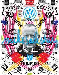
Salisbury quit Rolling Stone and opened up a Los Angeles office to focus on his growing branding business, a business that would eventually help reinvent Michael Jackson, make Levis 501s a household name, add the Paris to L’Oreal, design album covers for Randy Newman, James Taylor, George Harrison and many more, as well as create campaigns for more than 300 movies including Rock IV, Silkwood, Raiders of the Lost Ark, Aliens, and Jurassic Park. Salisbury would package Bubble Yum, brand Halo, and redesign Playboy, Hustler, Penthouse, and Surfing magazines several times over. There’d be almost no corner of the American psyche his work hadn’t wormed its way into by the turn of the century.
But, in 1975, he just wanted a break from magazines. Then, the phone rang at his new office. “The first call I answer is, ‘Hello, this is Francis Coppola, I’ve got a magazine and George Lucas said I should hire you to art direct.”
Coppola flew Salisbury, his wife, and son up to San Francisco in his Mitsubishi Turboprop and sent around a metallic, light-blue Mercedes stretch to fetch them up to his Pacific Heights mansion. “Nicholas Cage opens the door,” says Salisbury. “Jimmy Caan is playing the piano and George Lucas was there and [Copolla’s] sister, Talia Shire, and his father, who did all the music for the Godfather, and his mother was busy in the kitchen making dinner.”
The magazine was City and Salisbury recruited legendary Ramparts editor Warren Hinckle to help get it launched. One attention-grabbing cover featured the rhetorical statement “Why Women Can’t Get Laid In S.F.” across the bottom of the page just below a photograph of a leggy woman in a barely-there dress looking bemused while two disinterested men talk at a bar behind her.
“What I do is create metaphors,” says Salisbury. “Visual metaphors mostly.”
***
METAPHORS, tricks of communication by which difficult concepts are made easy through the magic of symbolism. The world is a stage. A white whale is dread. And Murphy is the everyman who surfs or dreams of it.
Before Salisbury began trafficking in metaphors, he dropped out of USC to stay with his folks who had finally settled in Oceanside for its proximity to the amenities of Camp Pendleton. In those days, Salisbury worked for an architect and design firm and surfed Pacific Beach, La Jolla Shores, and Sunset Cliffs on a 9’3″ Gordon & Smith in the winter with no leash. In his down time, he hung around the surf shops and traded logo work—Gordon & Smith, Bobby Thomas’ Challenger surfboards, Billy Caster—for boards and bread.
“Did you ever read The Pump House Gang? That’s where I started surfing, with those guys. There was this great outlaw side to surfing. It didn’t have the best image when John [Severson] came out with the magazine…a heavy job was to make that magazine get a broader appeal,” says Salisbury. “And that was one of the reasons he got Murphy in there.”
The question was how to broaden the product’s appeal while maintaining and enhancing its inherent cool? Salisbury solved that problem with just about everything he did, from Surfer to early ad work for Birdwell Beach Britches to Levis to Gotcha years later.
“I created what I felt were very sophisticated ads for them,” says Salisbury.
After Surfer and a short stint at Playboy, Salisbury began seriously honing his chops at Carson Roberts, the most creative advertising agency on the West Coast in the mid 60s. There, he worked alongside Ed Ruscha, future TV-personality Joel Siegal, and future Monty Python trouper Terry Gilliam.
This was in the late 60s, when Otis Chandler had finally wrestled control of the Los Angeles Times from his über-conservative forebears and set about reimagining the paper for the modern world. To that end, Chandler hired Jim Bellows, the legendary New York Herald Tribune editor and patron saint of new journalism. At the Tribune, Bellows started what would become New York magazine, the hip alternative to the fussier New York Times magazine and The New Yorker. Bellows, upon the recommendation of Siegal, who had been writing some for the Times, approached Salisbury to art a similar Los Angeles Times’ initiative called West magazine. 
“Everyone said, you can’t go there, because it’s this staid, republican paper,” Salisbury recalls. “I said, two million people will see me every Sunday and I get to do anything I want.”
With cutting-edge magazines such as Britain’s Nova and Germany’s Twen as touchstones, Salisbury proceeded to produce content and cover images that many still view as the apotheosis of West Coast publishing. Among them were an unfinished freeway ramp rising like a giant single-fin into the sky, Von Dutch painting the West logo on a motorcycle’s gas tank, the “Goodbye Ed Sullivan” cover with a tear coming from the CBS eye.
The concepts were instantly iconographic—meta and metaphorical—and they spoke volumes about a misread and underestimated city that was coming fast onto the world stage. In many ways, West provided the first second-look at a Los Angeles.
By the dawn of the 80s, surfing had the same issue—it needed a second look. By then, it had grown from a cloistered activity supplied out of bay-city garages to a regional cottage industry to something on the verge of being a global phenomenon. However, following the first-wave of tongue-in-cheek kitsch and the second-wave of action-based imagery, it seemed to have run out of interesting things to say about itself.
“Surfing had an image that wasn’t being serviced by the graphics that represented it,” says Michael Tomson, co-founder of Gotcha.
Surfing creative had grown safe and stale and Tomson was eager to boost his Gotcha brand with a vibe that would appeal to kids coming up on punk rock, MTV and increasing globalization. He called on Salisbury, who summoned his Pump House Gang roots for inspiration.
Salisbury’s work for Gotcha, and later O.P. and O’Neill was infused with punk-rock energy, animated color palettes, distressed text, and Peter Beard-inspired collaging. They told stories that took place out of the water as much as in it, stories about boys and girls and sex and cool. They were stories you could place yourself in, even if you didn’t live near a beach. To a large degree, the industry rode those stories into department stores across the world and Gotcha rose from zero to a $100 million company in less than a decade.
“We did some spectacular shit,” says Tomson.
***
ONE OF the landmarks of Salisbury’s career was Michael Jackson’s Off The Wall album-cover. Salisbury had seen Jackson in The Whiz and came away convinced he was the next big thing. “I know his manager from UA [United Artists] and I call him up and say, ‘Look, you gotta let me work on something for this kid. He’s gonna be huge.’”
Jackson happened to have a solo album in the bag, but nobody liked the cover. So, Salisbury headed over to DeMann’s office for a peek. “It looked like it was for the Sears children’s department,” says Salisbury. “I said, ‘Let’s put him in a tuxedo,’ because I wanted him to come out with this album like he’s Frank Sinatra… he’s not a kid anymore.”
Salisbury says DeMann wasn’t quite getting it when “all of a sudden, there’s this little squeaky voice from the back—there are these floor-to-ceiling curtains—and from behind the curtains comes this little voice, ‘I like it.’”
When Jackson later came up with the sequin-glove idea, Salisbury suggested he wear just one.
Those Levis ads that used iconic shots of Steve McQueen, Pete Towshend, Bruce Springsteen, and the Ramones in jeans, and put them on the side of buildings, were also Salisbury’s handiwork. In fact, when Salisbury was handling Levis creative while he was with Foote, Cone & Belding, he created the 501 brand name.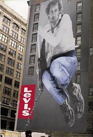
At the time, Levis didn’t have a traditional five-pocket women’s jean to compete with Jordache and jailbait Brook Shields’ Calvin Kleins. But Salisbury knew the cool chicks were taking Levi’s basics for men and shrinking and tailoring them. The stock number for the men’s basic was 501. That’s how people out in the world asked for Levis—do you have any 501s?
“I said register the name 501 as a brand name and we’ll say, Now Cut For Women, 501,” says Salisbury.
He designed a logo and then came up with the print and TV campaign, a takeoff on jean-clad James Dean in Giant kicking his boots over the front seat of that big, black car. “I said, I’ll do that, but with a woman.” The “Travis You’re A Year Too Late” ads were a sensation and pretty soon every woman had a pair of 501s.
***
FILMMAKER Doug Pray (Surfwise, Hype) recently started a documentary that attempted to tackle the question of Mike Salisbury and his impact on our lives. It quickly became clear to Salisbury, though, that a pithier approach was needed—a metaphor. From the abandoned doc, he came up with the idea of a TV show—Mr. Pop Culture: The true story about the birth of pop culture and the CIA operative who engineered it.
The trailer for Mr. Pop Culture begins with Salisbury’s disembodied head in black and white against a solid black background. “I’m Mike Salisbury,” the head says, “and I fought communism with sex, drugs and rock and roll.”
Next, John Lennon primal screams us into the Beatles’ “Revolution” while images from Salisbury’s life and work careen by—Hunter S. Thompson, Rolling Stone, Playboy, Pipeline, Andy Warhol, Camel Joe, Hotrods, Hot Wheels, Bubble Yum, Halo, Levis, Harrison Ford, Francis Coppola, Dick Dale, Aliens….and on and on.
It’s a mind-blowing barrage of postwar iconography and it all traces back to the one place, the epochal source of all these other metaphors. “People over there wanted to live like us and they wanted to be like us,” says Salisbury, “like Californians, really.”
The trailer ends with fuchsia and white text stating the obvious: communism didn’t stand a chance.